Ancillary Task
Digipak
a type of packaging for CDs or DVDs, typically made from cardboard with an internal plastic holder for one or more discs. The Digipak is a patented style of CD or DVD packaging that consists of a gatefold paper or cardboard outer binding with a plastic tray attached inside. The Digipak is not only Disc Makers' most popular CD packaging option, but the preferred choice of CD packaging for most major-label artists - and has been for years.
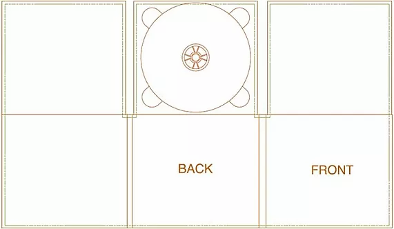
Dimensions
-
Standard Size "CD style" Digipaks:
-
1-Disc Digipak (4 or 6-panel): 5.45"W x 4.95"H x 0.25"D
-
2-Disc Digipak (4 or 6-panel): 5.5"W x 4.95"H x 0.44"D
-
-
DVDigipak: 5.45"W x 7.4"H x 0.44"D

Digipak Analysis

Digipak 1 Layout
The layout of this digipak is very simple in the way that many of the text items are placed centrally in order to stand out and draw the eye towards it.
also for the inside pages, the rule of thirds have been used to separate the information and keep it tidy without making it look like just one large block of text. this is conventional as many media products use the rule of thirds to layout objects on the page as it can be used to direct the audience's attention into a particular part of the page
Typography
The typography that is used in this digipak is very bold and uses a sans serif font style which is bold, this has connotations of independence which shows off the artist and her frame of mind and standing. this is unconventional in the way that generally serif typography is used for female artists due to the way that a sans serif font represents masculinity. the way that the font is bold draws the eye of the audience and then to the image of the artist. the same font is used throughout the entirety of the digipak in order to keep the theme the same and make each of the sections to look as if they belong with one another
Colour
the colours used for this digipak are very well thought out and contrast well with one another, also they are quite bright which fits with the genre of music, it also makes the other aspects of the magazine stand out such as the text, this is due to the contrast between white and the blue. these colours are conventional for the genre as they are bright and they reflect happiness, success and unity rather than being dark and dull, also these colours fit well with the overall design and look stylish, another convention of the genre.
Image
The image of the artist is central and a large mid shot on the front page, this helps to advertise the album and the artist through her image which is conventional for the pop genre of music. the image is conventional for the genre and the costume that the artist is wearing is also conventional for the genre as the clothing is fashionable a desirable currently.
Conventions
This digipak follows many conventions of form with the colours, layout and the image being all very conventional when linked to the pop genre of music, however the typography goes against conventions and stereotypes of gender as typically a serif font would be used for a female artist whereas a sans serif font has been used in this example, this shows that some conventions always need to be followed however this doesn't mean that all conventions need to be explicitly followed and sometimes, as long as it fits designers go against stereotypes and conventions to alter the image of the artist and to also present their products in a different way
.png)
Digipak 2 Layout
The layout of this digipak is fairly simple due to the high concentration of images and very minimal text used in the design, the images are all placed centrally besides one, which is placed in the right third with the track list that is placed in the left third, this organisation is typical for many media products as it allows the text to appear to be less and not just one big chunk, also it allows the text to be easily read and separate from the image. the use of the rule of thirds is very conventional and the positioning of the images also follow the conventions of form.
Typography
The typography that is used in this digipak is sans serif and bold font which can be clearly seen on the page. this font is conventional in the way that it stands out, also, it goes with the stereotypes of gender as the artist is male and a bold and dominant font has been chosen for the digipak. the bold font has connotations of Independence and masculinity which are both traits that can be associated with the artist through the use of this font.
Colour
The colours that are used are very abstract and contrast well with one another, the colours used are quite bright which is conventional for this genre of music as usually bright colours are used to draw the eye and to also keep the happy nature of the genre and the themes of happiness, success and unity that many of the songs portray. these colours draw the eye of the audience and stands out when placed next to many of the other digipaks from the genre with their more basic colour scheme.
Image
The images used in the digipak all all of the artist and are used to advertise the album with these images, however the shot types vary from close ups on the front which highlight the facial expressions of the artist and allows the audience to be able to relate to him more whereas the image on the back and the inside use mid shots and long shots which allows the audience to get a sense of his style and see his costume and body language , these shots of the artist are somewhat conventional in the way that he is displayed through the use of a variety of shot types allowing the audience to view the artist easily whilst looking at the digipak.
Conventions
This digipak follows almost all conventions in the ways of the colour scheme, images, layout and the typography that is used in its design, this shows that it is effective to follow as many conventions as possible whilst still keeping the design aesthetically pleasing so it attracts an audience of many people. the sans serif font is conventional for this genre of music and is typical for the gender of the artist making the style conventional and aesthetically fitting in with the design of the digipak. the colour scheme is conventional in the way that it used some bright colours which are conventional for the pop genre of music, but also with a mixture of darker colours that contrast well with the brighter colours which are more stereotypical for a male artist with more neutral tones and darker colours
Practiced Digipak Cover
Since we did not know how to design a digipak, we did a test run in order to develop our skills. We practiced to make just the inside cover of the CD. I used Photoshop and used the Filter tool alot in order to emboss and stylize the images accordingly. I played around with the opacity and saturation levels and dissolving to get the desired look.


Final Digipak Production


Website
A good website analysis explains how well the site supports the company's goals. Identify the company goals and how they relate to the Web presence. Including this information early in the report helps the executives or stockholders reading the report understand the purpose for the website.
Music Website Analysis - Gorillaz Website (http://gorillaz.com/)


A music website http://gorillaz.com/ - promoting British virtual band/supergroup, Gorillaz. The fabulous fictional universe of Gorillaz is not only explored through their CGI-based music videos, but also through the website; a place where fans can really indulge in the fascinating and intriguing world of the animated band. Unlike any other I have come across, this website could keep me informed and entertained for hours on end.
The web banner reads 'Gorillaz.com' and beneath is an interactive banner promoting the band's latest 12 minute track and music video 'DoYaThing'. This banner features the Gorillaz logo from the 'Plastic Beach' album and an animated picture of 2D, Murdoc and guest contributors LCD Soundystem's James Murphy and Outkast's André 3000. Although Murphy is animalised and quite unidentifiable, André is still recognisable (depsite his masked face) due to his signature top hat (an element that constructs his regular star-image). The fact that the Outkast rapper possesses a wide fanbase and is more of a worldwide star, means that fans from around the globe that visit the Gorillaz website will most likely acknowledge his guest contribution and become persuaded to listen to the new track...all at the click of a button.
To the top-right, fans can view broadcasts from Murdoc, Big Rick or 2D as they advertise merchandise, provide comedic band updates and cite links to various portals within the website (e.g. Murdoc's The Fall Pirate Radio Station.) These mini-broadcasts can be perceived as 'sample tweets' since below each broadcast are links to the member's twitter accounts; fans become enticed by the broadcasts and can easily access the band's twitter accounts in order to follow them 24/7. Furthermore, small icons linking fans to the Gorillaz MySpace, Facebook, YouTube, Twitter and iTunes pages provide an array of online platforms through which the band can market themselves and gain mass exposure (e.g. someone may share a Gorillaz music video on their Facebook page, spreading the band's brand-identity/image). These highly accessible links appeal to a young, tech-savvy demographic/early adopters and allow them to connect with the band even further.
On the navigation bar situated at the header of the website, there is an opportunity to register/login as a Gorillaz website member and gain an 'exclusive' status which allows fans to enter special competitions and receive newsletters, thus creating a close, intimate connection between the audience and the band. Moreover, the navigation bar presents various tabs which unveil different portals within the site. For example, G-Player (access to storyboards, games, discography), Mailing List (fans feel 'exclusive') and the Plastic Beach portal which is also advertised on the main body of the homepage; http://gorillaz.com/plasticbeach. The Kong studios-esque interactive "Beachsite" enables fans to escape to the fictional world of Plastic Beach, a concept on which the Gorillaz based their third studio album 'Plastic Beach' (2010) upon. Whenever I listen to this album, I often buy into this 'alternate world' the band aim to create and therefore, the idea of visually portraying this 'alternate world' in which fans can completely immerse themselves in, is ingenious. The 'beachsite' allows you to interact with almost everything, revealing band artwork, an entertaining online Plastic Beach adventure game, a chatbox to engage in virtual conversation with band members, song downloads and overall, allowing visitors to thoroughly explore the island.
Back on the homepage, there a various links to more Gorillaz-themed games, comedy sketches and the band's discography. Additionally, there is a news banner which keeps fans updated on all-things Gorillaz as well as promoting Damon Albarn's new musical project 'Dr Dee'. This is an opportunity for Albarn to attract attention to his other work and enables Gorillaz fans to gain a broader outlook on Albarn's various talents and incredible versatility as he is undoubtedly becoming one of the most influential and powerful musicians of his generation.
At the footer of the website, there are links to tour dates, mailing list registration and legal information such as terms and conditions, privacy and safety. Lastly, the iconic Gorillaz logo is illustrated in the bottom right-hand corner - an essential component which features on most band websites in order to create a recurring visual 'motif' and to increase brand awareness.
Website Analysis #2

Final Website Production
I myself made the website and to make it look interesting, i made a gif clip of our main actor. I designed the shirts with the name of our album as merchandise.
To give it a professional look i used the same color scheme on the website as digipak and Final Video.


